Journey-Blind Buttons: The Untold Pitfalls of One-Size-Fits-All CTAs
Have you ever clicked on a button labeled “Learn More” and asked yourself, “What exactly am I learning more about?”It is not something big, it is barely noticeable in a site, yet it continues all the time. You are reading something interesting, and the only next move that was offered is ambiguous and generic. It seems that button was not made to fit you. And that’s where it gets really interesting considering the concept of journey-blind buttons.
Journey-blind buttons are CTAs that present the same look to everyone, whether they are just exploring blogs about digital marketing strategies or actively comparing products The button says the same thing, “Request a Demo” “Contact Us” or maybe just “Learn More.” It seems like a pretty safe choice, but the more you look at them, the more you realize how much they miss the moment.
What really shines is this: Personalized calls-to-action can convert more than twice as well as those generic ones. Just to put it in context, this is a really big difference. Over 96 percent of new visitors on the website are not ready to buy. So why rush these people into a decision they are not prepared for? Imagine you are reading blogs from a SaaS company on data security. There is a lot of interest and learning, but you are not yet ready for a product demo. So, at the end, if the only CTA is “Request a Demo,” it feels like it doesn’t align with your content mindset. But if it reads “Download Our Free Data Security Checklist,” then it fits well with your frame of mind. It doesn’t ask much of you by giving you something useful.
These fleeting moments affect the brand experience of each user. In this blog we’ll cover the hidden costs of journey-blind buttons, how they affect your users and your business, and what a better, smarter CTA strategy would actually look like.
Read: Breaking Down Barriers: How Custom Software Empowers Small Businesses
1. Why generic CTAs fail
Now that we have seen how journey-blind buttons end up lacking on the surface level, let’s take a closer look at what is really going on underneath. Driven by recent innovation in event production, the integration of journey-blind buttons provides tactile, high-tech navigation cues that empower visually impaired attendees to traverse venues independently. The real issue is bigger than the missed clicks. It gets into how people think and behave when they come to your site. And this is where it gets even more interesting.
Remember that instance when one is reading a blog post and suddenly gets a button asking him or her to request a demo? The person is in a curious frame of mind trying to learn. Then, without notice, the user is pushed towards making a decision. By redefining parking management, cities can utilize “journey-blind” buttons—automated controls that execute parking maneuvers without needing pre-mapped route data—to ensure safer and more efficient vehicle storage. The pressure creates discomfort, an instance of cognitive dissonance. Discomfort creeps in when something does not match our current state of mind. The button is just simply asking too much. That jarring difference makes the whole experience feel off.
When users perceive their experience to be negative, such experiences result in their eventual pullback which often leads to decision fatigue. When faced with a seemingly overwhelming or irrelevant choice, people usually end up opting to do nothing at all. Enhancing workspaces with tactile journey-blind buttons ensures that visually impaired employees can navigate office interfaces independently, creating a more inclusive and efficient professional environment. For instance, a “Talk to Sales” button has a very high commitment in theory, but becomes noise in practice when a visiting customer is not ready to click. This leads to hesitance or worse, abandonment.
These moments eventually influence user perception toward the brand. Trust begins to die when they do not feel understood. When a company is not addressing its needs, it can begin to feel detached. It is difficult to overcome that loss of connection. People want more. Personalized experiences are now expected by 71 percent of consumers. When they fail to get it, they tend to walk away. Almost 89 percent reveal that they have turned to a rival because of bad online experience.
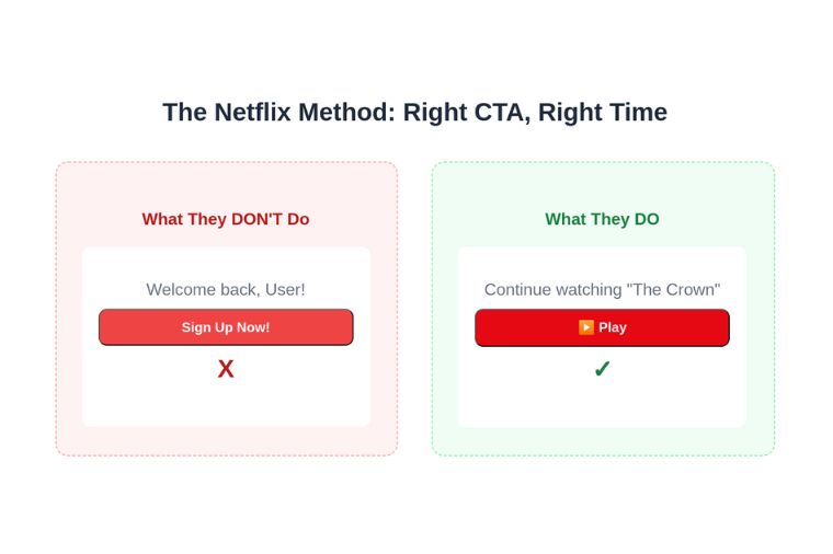
Netflix is a great example of getting this right. When a user logs in and opens the app, the first thing they do not see is a “Sign-Up Now” button, ridiculous though it might sound. Instead, users see Continue Watching or Play because Netflix knows very well the kind of audience it is dealing with. Such clarity in communication keeps people engaged.
3. Impact of Irrelevant CTAs:
Journey-blind buttons can silently erode trust and introduce friction to users. The effect goes beyond only impairing user experience; it also affects the very core metrics that drive growth. Behind any wrong CTA lies not only a confused visitor but also a lost opportunity.
- Declining Conversion Rates:
The most direct impact of this is on the conversion. When the CTA does not match what the visitor wants, fewer people take action. This leads to a lower volume of leads, fewer demo requests, with just folks hanging out for a shorter time on the page. There may be interest, but somehow the next step seems wrong, and the moment is lost.
- Leaky Sales Funnel:
The ripple effect goes on through the sales funnel. Ads or blog content may help you attract the right audience, but unless you have a way to lead them onto the next proper step, they will fall off. The traffic exists but the flow fails. Without any sense of progression, leads just slip away.
- Wasted Marketing Spend:
This is also financially costly. Each visitor is not free and it costs through advertisements, content, or outreach. When the visits fail to convert the money is wasted. A large volume of traffic and low conversion implies high cost per lead and poor ROI on marketing spend.
While there is an obvious challenge, there is a bright side to it. The companies that invest in nurturing leads with the right steps find themselves generating more qualified prospects and at lower costs. This is where personalized CTAs are really helpful. Even the tiniest improvement in relevance could yield better engagement, more efficient budgets, and stronger revenue growth.
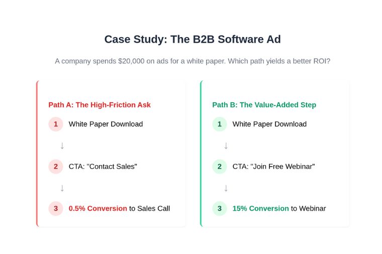
Take, for instance, a B2B software company that spends $20,000 a month on LinkedIn ads advertising their white paper. In one version, the thank-you page says simply, “Contact Sales.” Conversion to a sales call is merely half a percent. In another version, the CTA invites users to an associated webinar. Fifteen percent sign up. Later when they ask for a discussion with sales, more feel prepared to. The difference is clear.
4. Mapping CTAs to the Buyer’s Journey
So now after seeing those irrelevant CTAs drain conversions, throw away so much money, and let so many valuable leads slip away, the next step is easy. Real cure does not merely require changing the button; it needs re-conceptualization of the whole journey itself. The key is in understanding what users require at all stages of the journey before leading them along with the appropriate CTAs.

- Awareness Stage CTAs:
Every buyer goes through a buying process. It starts in the discovery stage, where the buyers just start exploring a particular topic, not yet ready to discuss anything sales-related or even see the product demo. At this stage, the best-performing calls to action are those that provide valuable information in the form of guides, checklists, or blog subscriptions. Such simple actions build trust while keeping the user involved.
- Consideration Stage CTAs:
Next is the consideration stage. Here, the buyers are doing comparative analysis of solutions and trying to know what makes one option better than the other. This is the time to provide CTAs that bring in more learning through webinars, case studies, or demo videos. These relate your offering to the specific needs.
- Decision Stage CTAs:
Finally, we are at the decision stage. The buyer is ready to move forward. Now, the CTAs should facilitate the way forward. Simple next steps such as initiating a free trial, requesting a quote, or booking a call would make sense at this stage.
This approach basically becomes powerful since it emphasizes human-centric decision-making. Every step creates a process of guiding rather than pushing; in other words, giving out choices that feel right and appropriate as opposed to burdening one with choices that feel forced.
Almost all marketers today are still grappling with how to define a clear content plan. Map call to action (CTA) stages within the journey stages for structure and guidance to keep teams focused. This proves even more important in the B2B environment where frequently sales require more than one interaction.
5. Implementing a Journey-Aware CTA Strategy
With a now very clear understanding of how to align CTAs to each stage within the buyer’s journey, it is time to implement the strategy in practice. Now comes turning the theory into action: getting into the mind of your audience and setting up a mechanism for real-time response to their needs.
Step 1: Audience & Journey Mapping:
Journey mapping is the first step. You need to develop key customer personas and define the various stages they go through from discovery to decision. What questions do they have during that time? What will move them forward? This is where everything begins.
Step 2: Content Auditing & Gap Analysis:
Next up-write an audit of your existing content. Go through all blog posts, white papers, videos, and case studies and assign each of them to a stage of the customer journey. This allows you to see where your content supports or does not support the user’s experience. Most companies find that they are strong in one stage but have gaps in others. Fixing these gaps is the first step toward improvement.
Step 3: Leveraging the Right Technology:
After you have achieved clarity regarding your journey and your content, the next step is to use the right tools. Marketing automation platforms allow for the creation of intelligent CTAs. These buttons change based on the identity of the person visiting the webpage. For example: A new visitor would see, “Download the Industry Report”; and a returning lead would see “Book a Consultation.” Setting up this type of personalization takes very little time and is easily scalable.
Step 4: A/B Testing and Optimization:
But it doesn’t stop with building the system. It needs to be continuously improved and made better. You can try different CTA messages, places where they stand, or designs; each one can lead to only a major leap in gains. Companies that invest in testing and targeting programs observed improvement of as much as 300% in conversion rates. Small changes over time accumulate to cause big results.
It also directly connects with marketing efficiency. The marketing automation industry is continually growing and is expected to reach more than $11 billion by 2027. One of its core promises is to scale up personalized experiences. Journey-aware CTAs are a great example of that promise working.
Conclusion:
Journey-blind buttons are simple to construct but very expensive. They cause breaks in the user experience, reduce the conversion rates, and end up wasting the marketing investments. These generic CTAs fail to recognize the stage a visitor is at in the decision-making process and hence miss the opportunity to move the visitor forward, which results in leads stalling or being lost altogether.
The future is personalization. Mapping CTAs to different phases of the buyer journey is one of the ways to make static websites responsive. It is not about asking the user to act but on assisting the user in making the appropriate next move. It is not only a marketing adjustment, but an actionable decision in terms of trust, enhanced performance, and long-term growth.
Author’s Bio:
Vidhat Anand is the Founder and CEO of Fragmatic, a web personalization platform for B2B businesses. He specializes in advancing AI-driven personalization and is passionate about creating technologies that help businesses deliver meaningful digital experiences.